Responsive websites a must for maximum online reach
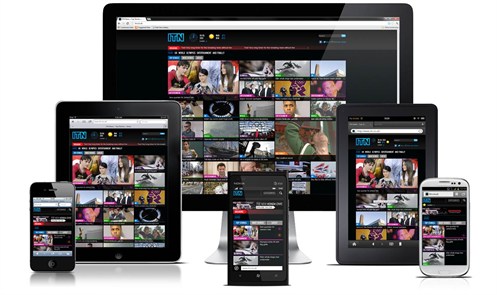
As Google now give priority to mobile friendly web sites, for maximum online reach it is essential that your web site is responsive and formatted to display correctly on multiple portable devices such as smart phones and tablets.
With over 50 percent of users worldwide now surfing on portable devices, it’s important that you up your online game and ensure your web site automatically reconfigures it’s content to display in a user friendly way on iPhone, Android, Windows Phone and BlackBerry mobile phones and
Click here to learn more
.
Web site design illustration 5
When you download / open a web page the web site’s server identifies the device on which the site is being viewed, such as Firefox (desktop browser), a Safari browser (on an iPhone) or a browser using Android, and (if the web site has been coded correctly) the server hosting the web site presents the content formatted in a manner that displays best on that device. If your site isn’t functioning in this way, it’s time that it did!
An excellent example of a multiple device friendly web site incorporating streaming video among the home page content is that for The Orient Express.
If you would like help in reviewing your site and, if it needs it, adding some code to ensure that it displays correctly on multiple viewing devices – we would be more than pleased to help!
Contact us now and let’s bring your web presence up to speed – ensuring that it doesn’t get bumped down on Google’s search results for not being mobile friendly and multi device compatible.